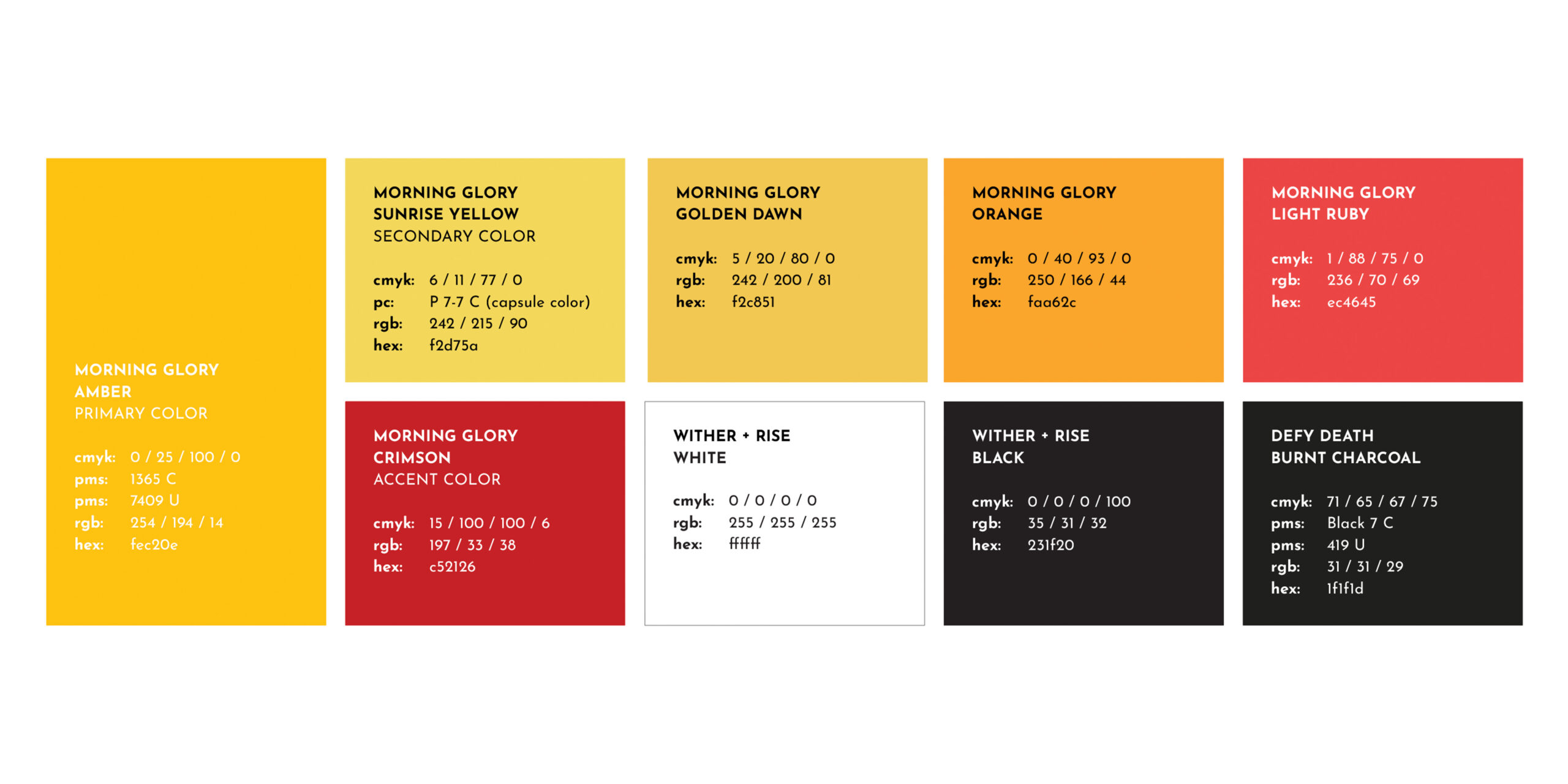
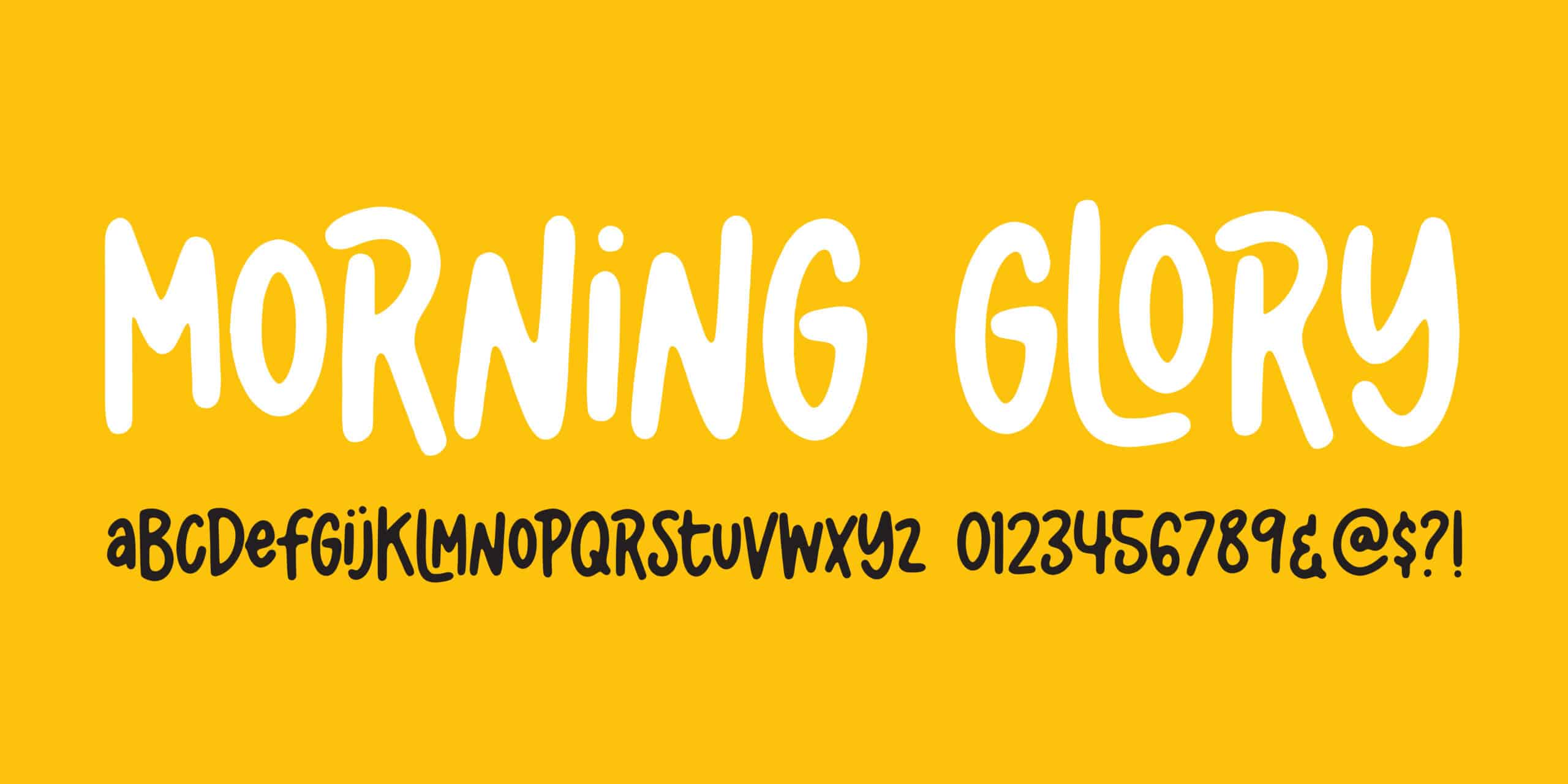
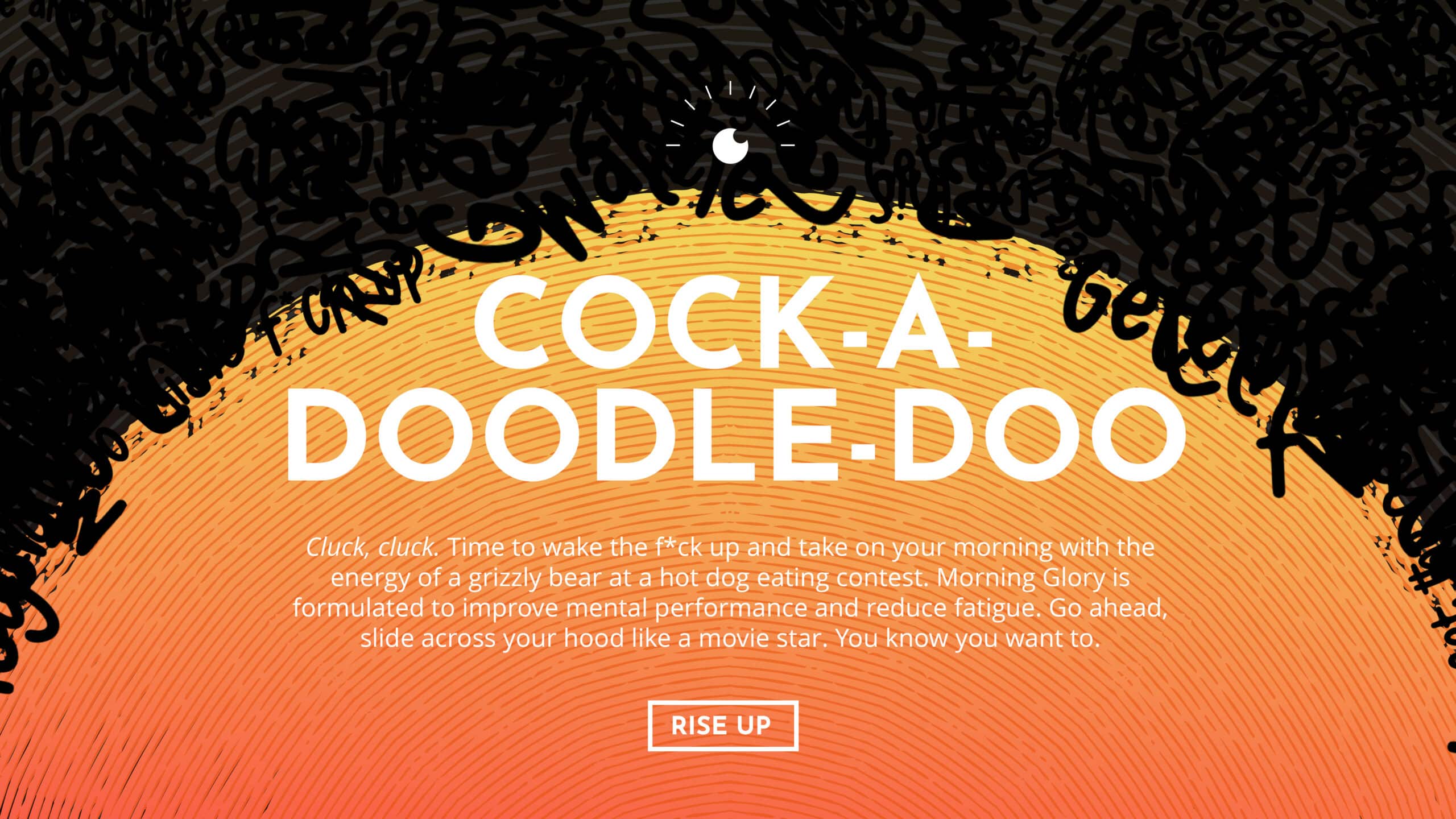
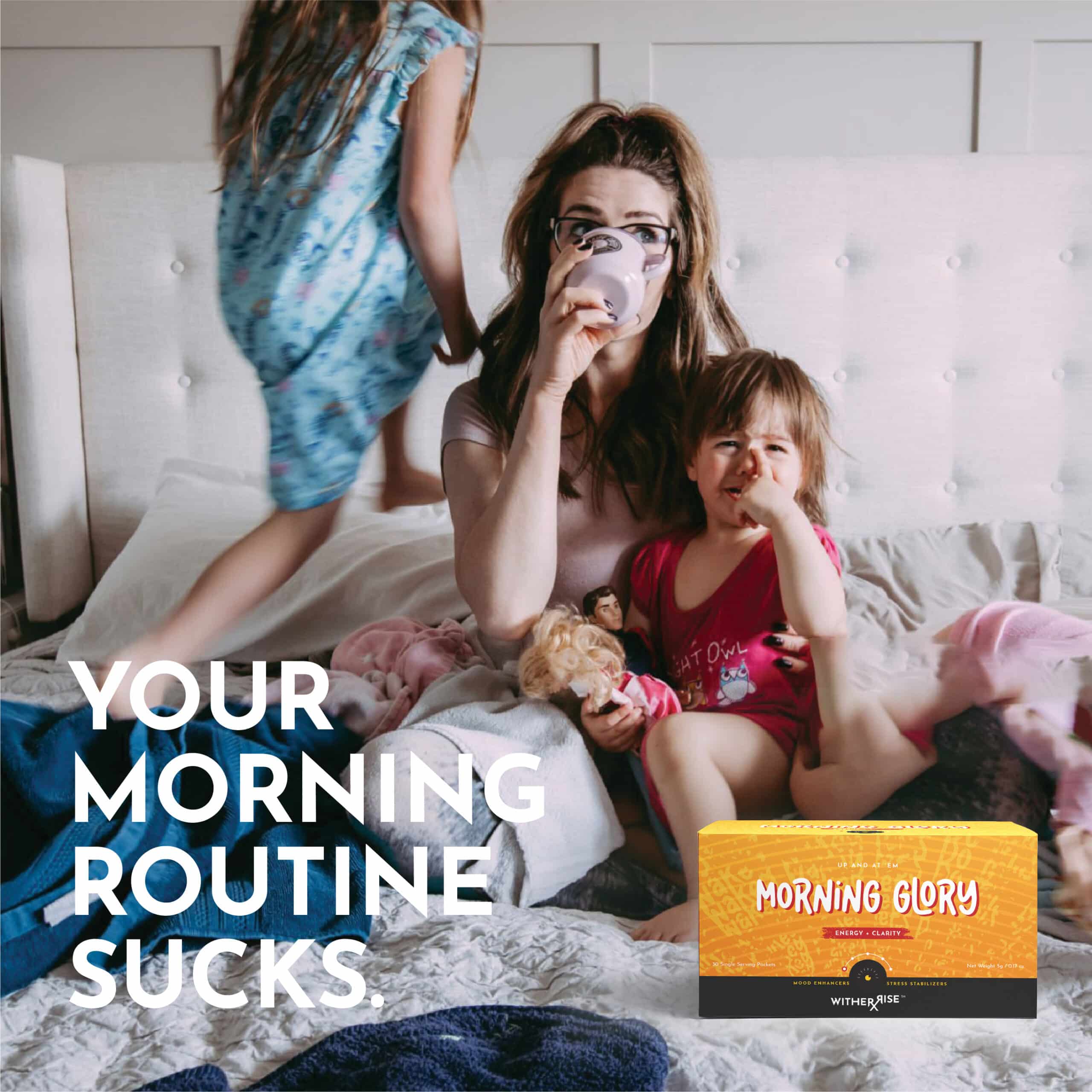
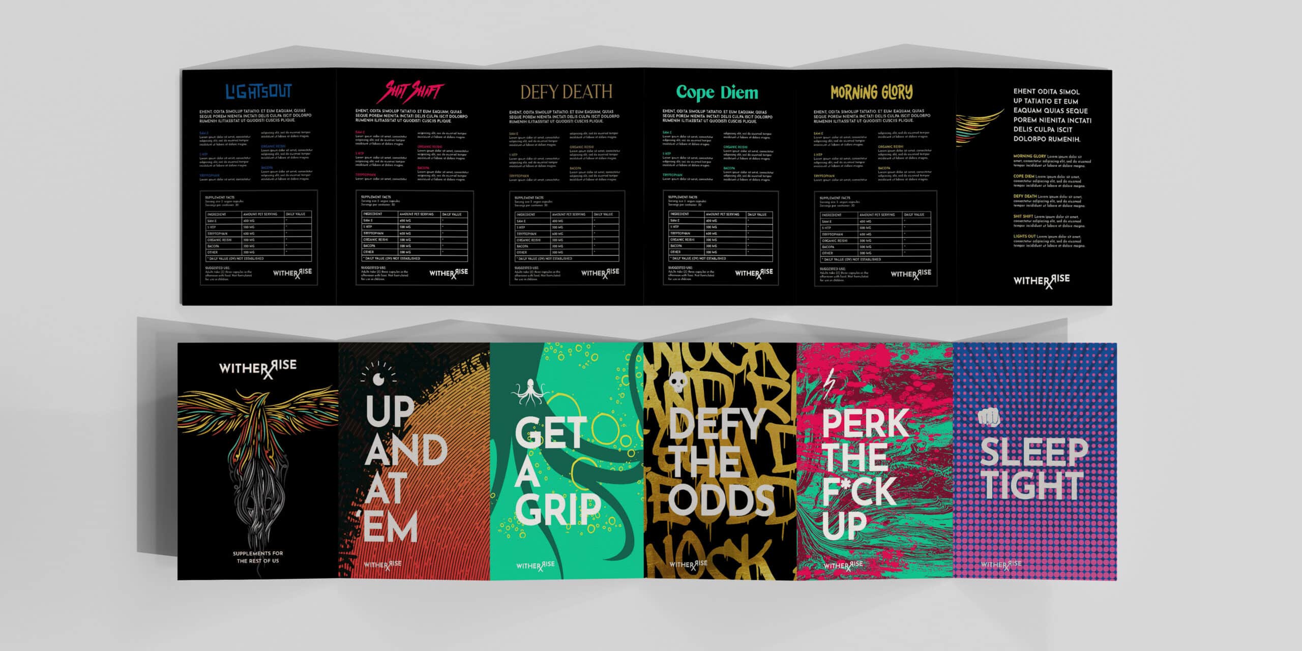
First we wither, then we rise.

From a single natural mood and stress formula to a complete brand system — strategy, identity, packaging, and five sub-brand SKUs, built across sixteen months.

Client
Wither + Rise
Year
2023-2024
Role
Lead Agency
Services
Brand Strategy, Digital, GTM, Identity, Naming, Packaging, Print, Research, Segmentation
Full bleed project image
Brand identity — environmental signage
The Brief

"I have a formula. I need everything else."

The founder came in with one thing: a natural formula he believed in. No name. No identity. No category position. No package. No voice. Just a formula and a feeling that the supplement industry had stopped talking to people like him.

The category itself was the trap. Every supplement brand on the shelf was built for the person already in the gym, already in the studio, already inside the wellness aesthetic. The actual majority was overstretched, under-represented, holding it together between Zoom calls. Nothing was made for them.

We were brought in to build the entire brand. Top to bottom. Strategy through manufacturing.

01
A category written for someone else

The supplement aisle was crowded with sameness. Gym rats, yogis, optimization personas. None of it spoke to people who weren’t already inside the wellness category. The default audience was wrong before the work began.

02
An audience the industry pretended didn't exist

Everyday people had been segmented out of the category they could most use. Stressed, tired, time-starved, skeptical of marketing, and barely celebrated for the herculean effort of getting through a Tuesday. The biggest audience in the supplement category was the one no one was building for.

03
A brand that needed every part built

There was no logo. No name. No package. No voice. No website. No messaging. No manufacturing partner. The work wasn’t to refine an existing brand. It was to build one — from a formula in a beaker to a unit on a shelf.

Brand identity — primary logo application
The build

For The Everyday Person

Most brands pick a psychographic and build for it. We did the opposite. We stopped building for a type of customer and started building for human states.

Stress is a state. Burnout is a state. Sleep is a state. Mood is a state. Every person occupies all of them across a single week. So we built five sub-brands, each one a human moment. Morning Glory for the start. Cope Diem for the spiral. Defy Death for the long game. Shit Shift for the mood reset. Lights Out for the night. Same person. Different day. Different need.

Not a brand for one type. A brand for every type. Every kind of human. Every kind of day.

First we wither. Then we rise.

witherrise-logo-submark
witherrise-whitelogo
Paper stationery company logo mockup
Our approach

Build the product. Create the Space.

Sixteen months from formula to manufacturing-ready system. Twelve disciplines, one through-line: meet every human, exactly where they are. Market segmentation that rejected the category’s defaults. A positioning that earned a skeptical audience. An identity system with five distinct sub-brands inside it. Packaging engineered for real production, not concept boards.

We weren’t a vendor on this. We were the team that built the company. Naming, identity, voice, package, label, sourcing, manufacturing. Everything except the formula in the bottle.


01
The audience truth

The work started by mapping every state the category had ignored. Stressed, tired, sleepless, fed up, recovering, rebuilding. Then the archetypes that held those states: Everyday People, No-Bullshit Man, One-Less-Thing-To-Do Woman. The audience came out of empathy, not algorithm.

02
The positioning conviction

Superior Fit: a brand built for everyone the supplement aisle had stopped talking to. Reinvented supplements for the rest of us. The strategy was a position. It was also an attitude. Calling BS on category sameness while still making something people would actually take.

03
Designing + Building Systems

Master brand and five sub-brands designed in parallel. Morning Glory, Cope Diem, Defy Death, Shit Shift, Lights Out. Phoenix mark, full typographic family, packaging system, copy architecture, label design, manufacturing specs. Built ready to ship.

witherise-defydeath-ingredients-scaled.gif
witherrise-productcaps.gif
witherrise-copediem-ingredients-1-scaled.gif
The System

As human as it gets

Most brands solve one need with one identity. Or they stretch one identity across many needs and go generic on every front. The category default is to oversimplify the human.

We did the harder thing. Master brand at the top: one phoenix, one anthem, one conviction. Five sub-brands underneath, each with its own typeface, palette, iconography, and voice. Cope Diem looks nothing like Defy Death. Defy Death sounds nothing like Shit Shift. Each was built to meet one specific human moment in one specific register.

Because the same person needs Cope Diem on Tuesday and Lights Out on Wednesday. Real people aren’t a persona. They’re a Tuesday morning. A Thursday spiral. A Sunday night. A Monday rebuild.

Morning Glory

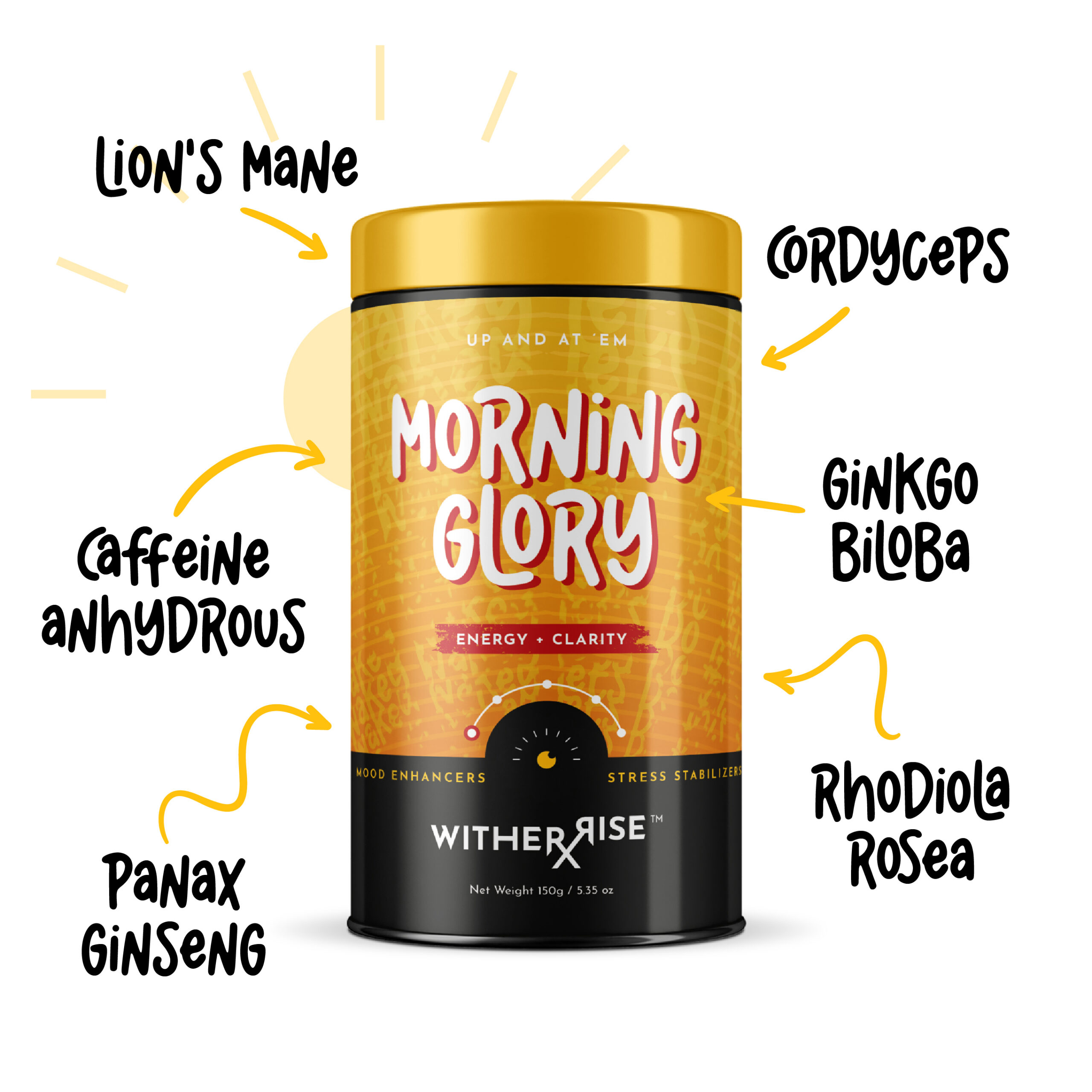
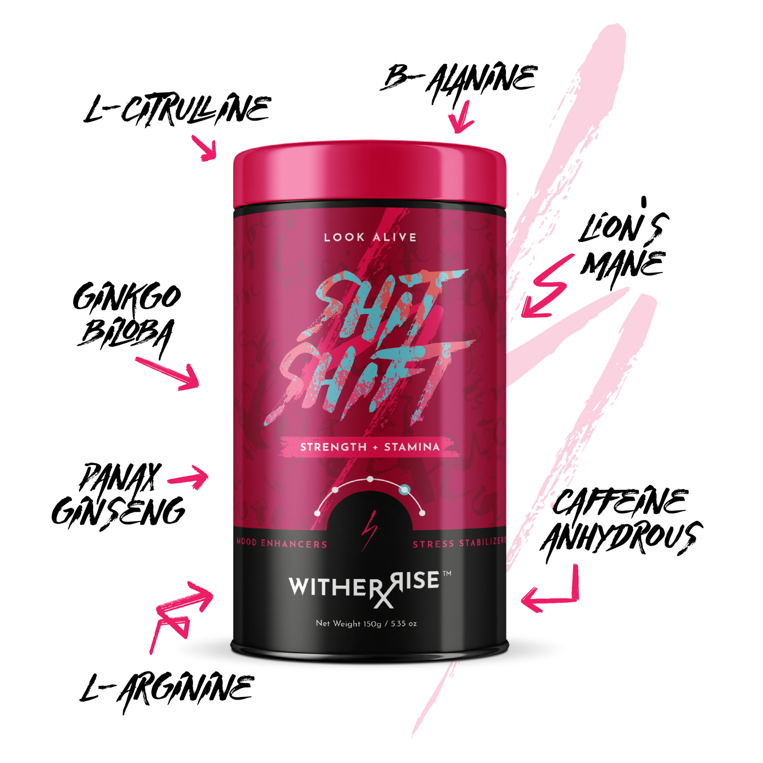
Punch today in the face with our unique blend of energy-boosting, natural ingredients, formulated to improve mental performance and reduce fatigue, so you can take on your morning with the energy of a grizzly bear at a hot dog eating contest. Go ahead, slide across your hood like a movie star. You know you want to.

Cope Diem

Not every presentation is going to be a banger. Shake it off. Get your mind right with our mood-boosting mix of natural ingredients, blended to give you the calm and focus of a superhero in a slow motion fight scene. What do you want me to do with that report!? I can think of a few options.

Defy Death

Supercharge your defenses with our powerhouse blend of natural ingredients designed to fight fatigue and daily stressors. Hit send on that email and pop by the gym to make sure your membership is still active. Karl bought the farm. Karl bought a farm. Big difference. Time to start taking care of yourself.

Shit Shift

Shitstorm? No thanks. You are the storm. Our unstoppable blend of natural ingredients will give you the strength and stamina to take on what just might be the hardest part of your day. What do you want for dinner? A fist full of rocks? Now that’s the attitude.

shit-shift-1_1.jpg

Lights Out

Chase down your racing mind and give it a wedgie to show it who’s boss. Our dream team of natural sleep aids were formulated to help you get to sleep faster, stay asleep longer, and wake up rested. Queue the crickets.

lights-out-1-1.jpg

The record

What we built was primed to perform.

01

One master brand. Five sub-brands.

Morning Glory, Cope Diem, Defy Death, Shit Shift, Lights Out. Each with its own typography, palette, iconography, and voice. All laddering up to one phoenix.

02

Top to bottom.

Segmentation, strategy, naming, identity, voice, packaging, label, sourcing, manufacturing. Built ready to ship.

03

Built for every human state, not one customer type.

Sub-brands designed around what people actually feel: stressed, tired, sleepless, fed up, recovering. Empathy over algorithm.

04

A complete brand voice, top to bottom.

Brand anthem, messaging architecture, product copy, packaging language. Five distinct sub-brand registers. One master brand conviction.

05

Production-ready packaging across the full line.

Not concept boards. Five SKUs designed, sourced, and engineered for real manufacturing.